
Stately Credit
UI/UX
UI/UX Design for Stately Credit, an up-and-coming startup in the financial space. Created both a web and mobile optimized experience for consumer banking and borrowing.
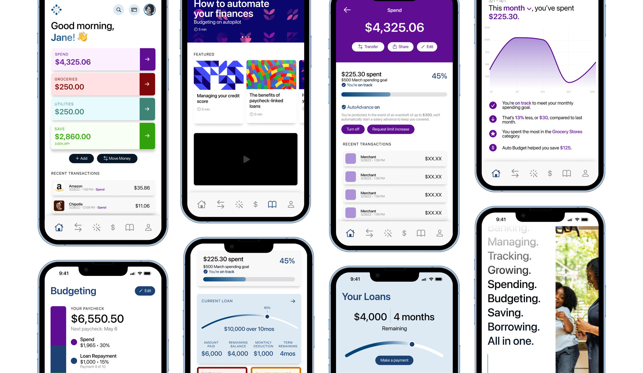

Stately Credit is a fintech startup building an all-in-one banking product: personal banking, savings, budgeting, payday loans, and financial education all in one place. My job was to design a system that held together across mobile and web without just stretching one layout to fit the other, since the two platforms get used completely differently.
The dashboard had to do two things that usually fight each other: show someone their whole financial picture at a glance, and still let them dig into specifics. Pockets, Stately’s feature for splitting an account into sub-categories for specific goals or expenses, became the centerpiece. I built a visual way to move money between Pockets and track progress toward each one, plus default deposit rules so a chunk of every paycheck routes into savings automatically instead of requiring someone to remember to do it.
Consistency across devices meant building an actual design system: shared typography, iconography, and components rather than one-off screens. I paid particular attention to users who aren’t financially fluent, since a lot of fintech UI assumes everyone already understands APRs and compounding, and Stately’s audience often doesn’t.
I worked closely with product and engineering to get the prototypes right, and usability testing kept surfacing real gaps between what I assumed users understood and what they actually did. That feedback loop is what pushed the interface toward simpler explanations rather than more polished ones.
The version that shipped gives users a clearer read on where their money is and an easier way to move it where it needs to go, which was the actual goal from the start.
Mobile App


Web App


