jason zhang is a multidisciplinary designer and computer science student building thoughtful experiences across mediums to move people and ideas.
about jason
i’m jason zhang, a sophomore computer science student and multidisciplinary designer at the university of michigan.
i create thoughtful experiences across platforms—whether that’s designing intuitive ui/ux, shaping brand identities, editing video, or building digital products. my work lives at the intersection of design, technology, and social impact, where small details change how people experience technology, connect with ideas, and drive social change.


toolbox

Figma

Final Cut Pro

Framer

Photoshop

Illustrator

Premiere Pro

C++

Swift

SwiftUI

Python

VSCode
education & relevant coursework
EECS 183: Elementary Programming Concepts (A)
EECS 203: Discrete Mathematics (A)
EECS 280: Programming and Intro Data Structures (A)
EECS 281: Data Structures and Algorithms in C++ (A-)
EECS 376: Foundations of Computer Science (Currently Enrolled)
EECS 370: Introduction to Computer Organization (Currently Enrolled)
SI 110: Introduction to Information Studies (A)
SI 356: Introduction to Web Development (Currently Enrolled)
SI 207: User Experience Design (Currently Enrolled)
experience
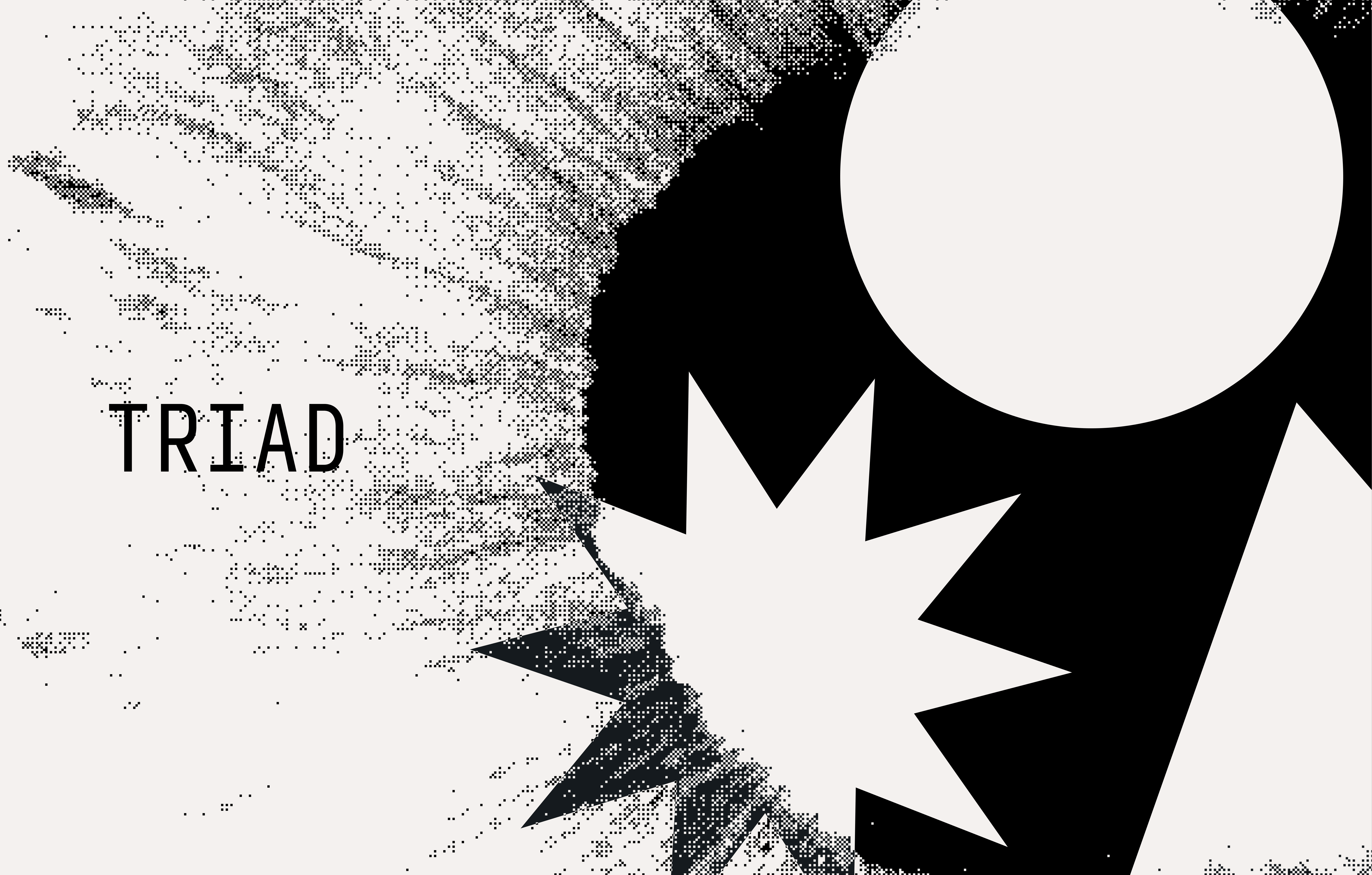
Triad
A habit tracker & wellness app built on the foundations of Sartre's Existentialist school of thought.
Triad focuses on three daily rituals: project who you want to be each morning by laying out 3 concrete actions you'll take throughout the day, pause in the afternoon to ground yourself, then sum your actions in the evening to reflect your day.
Triad acts as a compass for who you're becoming—not by obsessing over aspirations, but rather moving in the right direction with real action.

Bluesearch
Bluesearch is an AI research assistant designed to streamline scholarly research in the humanities—the University of Michigan Library has a lot of resources, and Bluesearch helps students find what they need, with natural language.
LLMs are fantastic at understanding human language and context, but often get things wrong when performing research, whether it be hallucinating facts and details or making up false citations.
Bluesearch acts as a research tool—it won't write for you. Instead, it uses LLMs in a thoughtful way: helping you refine your topic, narrow your search, discover relevant sources, and organize your thoughts.


